makemepulse is a global interactive production studio. They create immersive digital experiences: Light-as-air tech with purpose. They wanted to create a brand identity to reflect their philosophy.
During my three years as Creative Director at makemepulse, I oversaw and designed much of their production. It felt natural for me to take on the design of the new brand identity and portfolio.
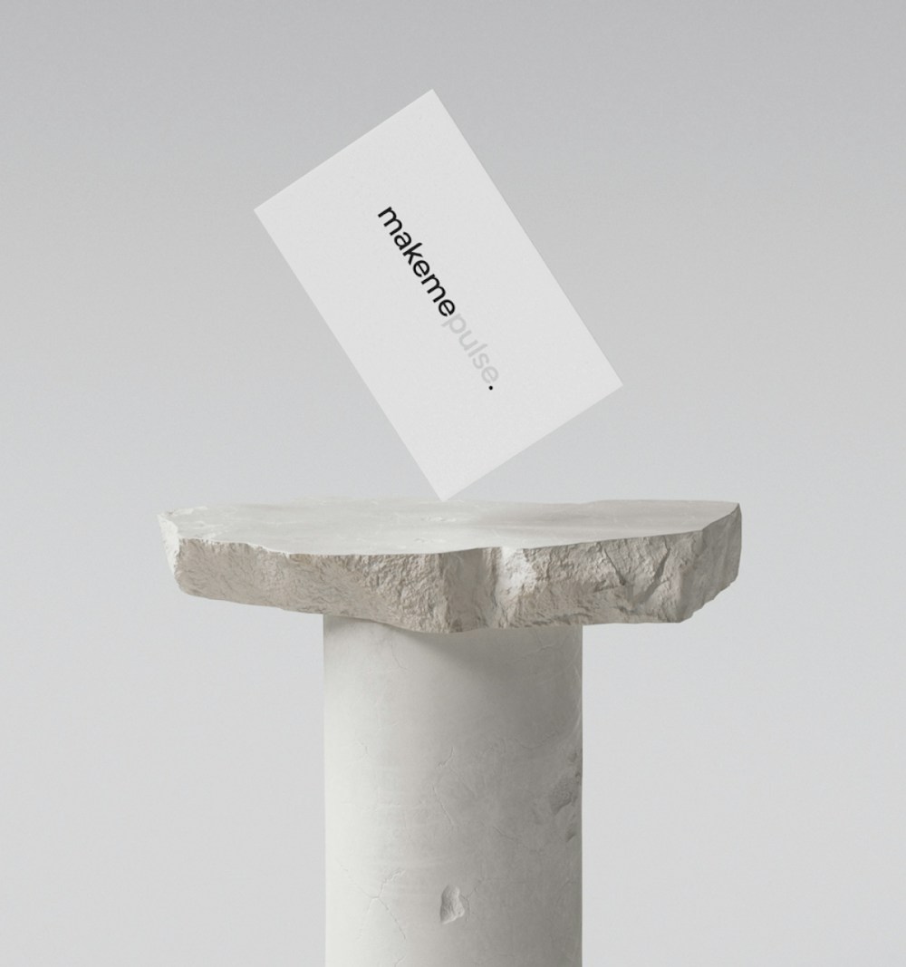
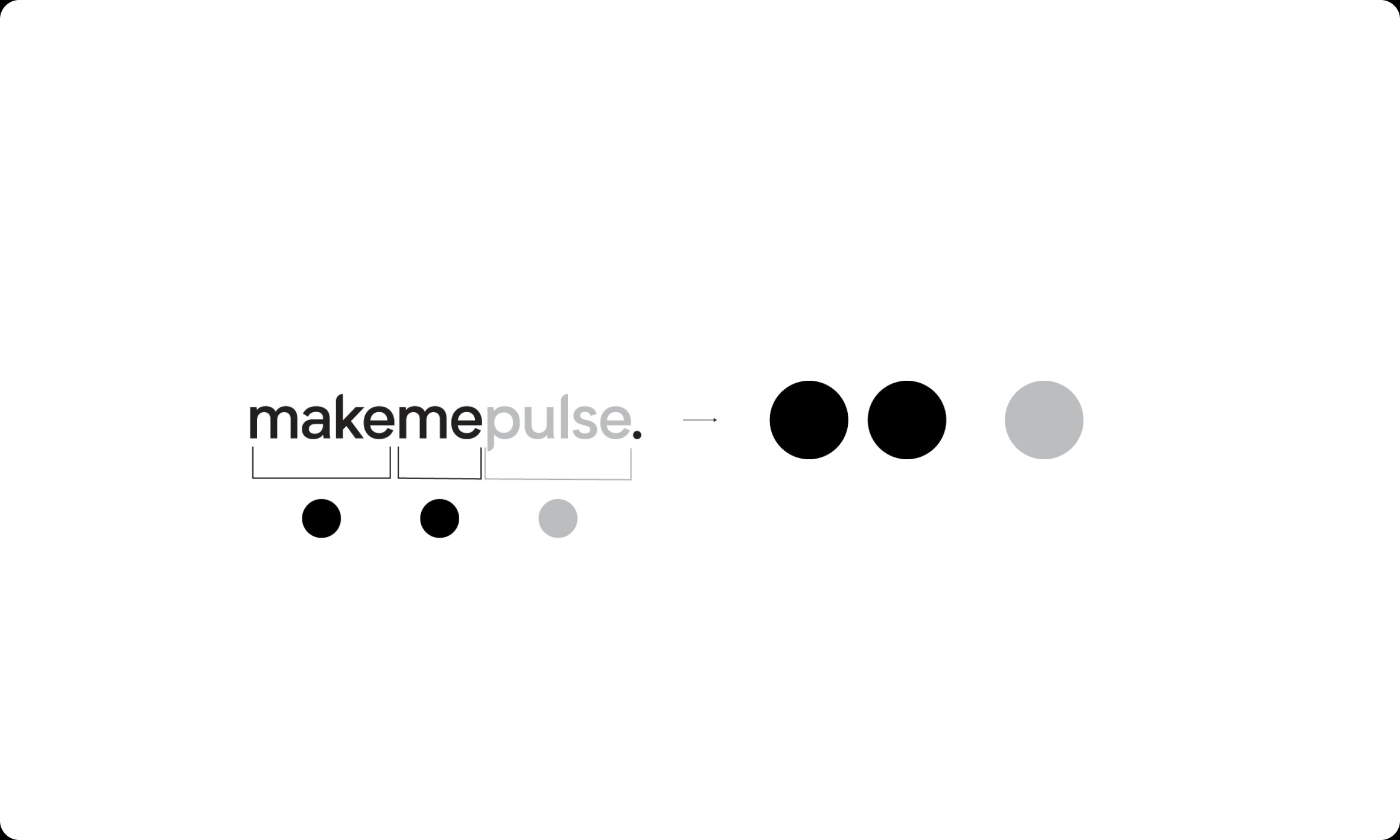
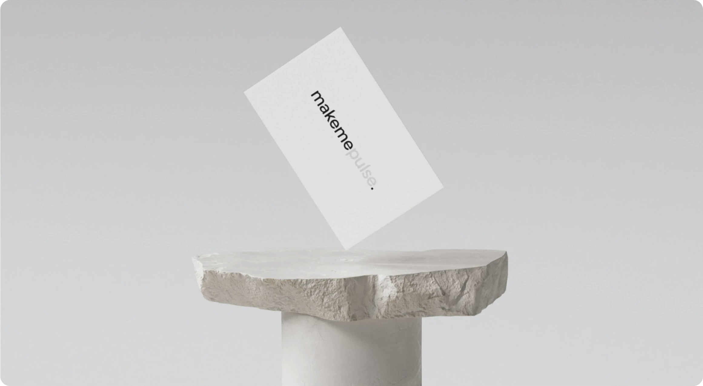
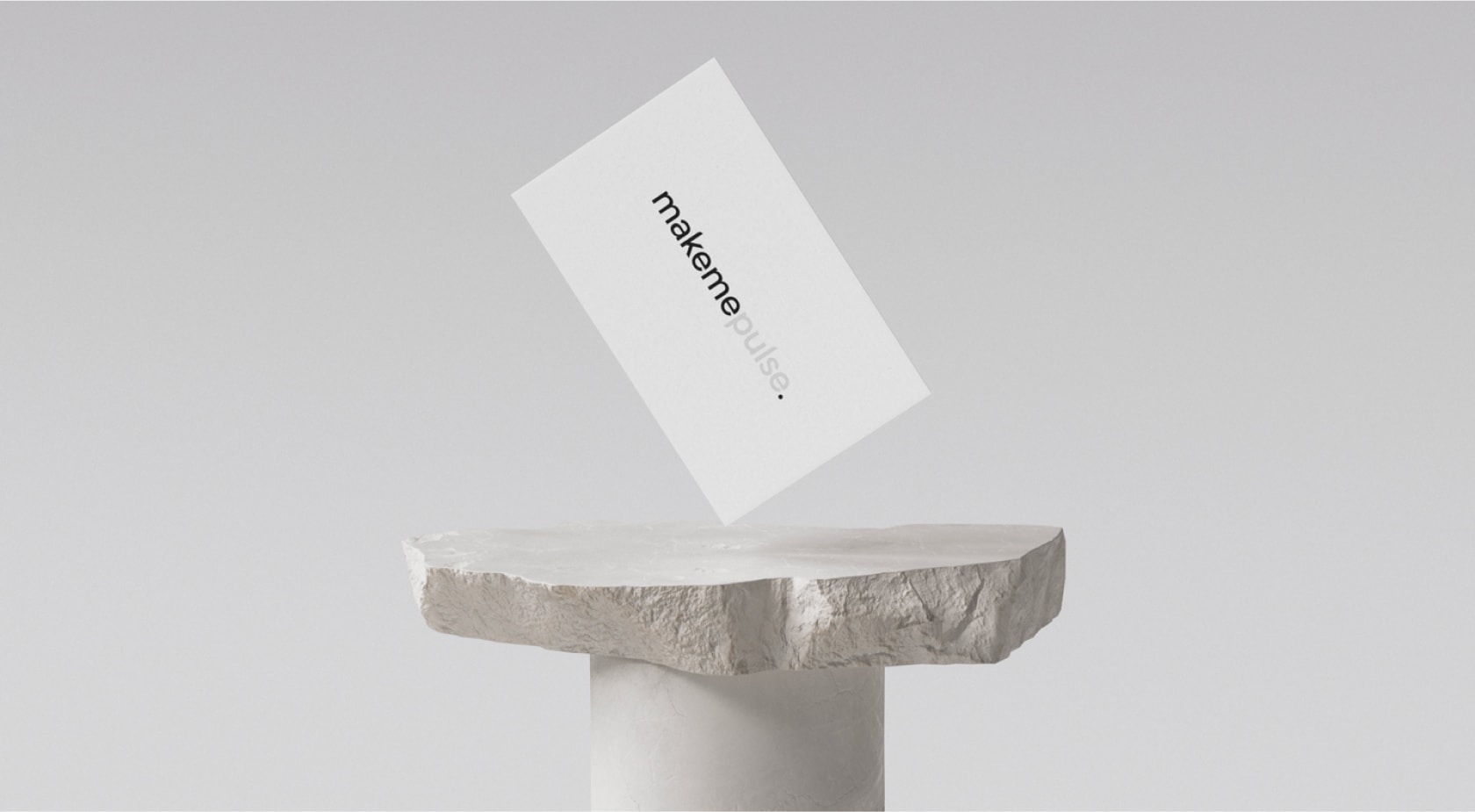
The logo was inspired by a playful concept from the team: the studio's name was adapted for various use cases by changing the last word 'pulse' to reflect the theme.
For instance, interactive experiments were hosted on a website called 'makemeplay' Spotify playlists were titled 'makemedance_01' and the weekly rock climbing team activity was organized in the 'makemeclimb' Slack channel.


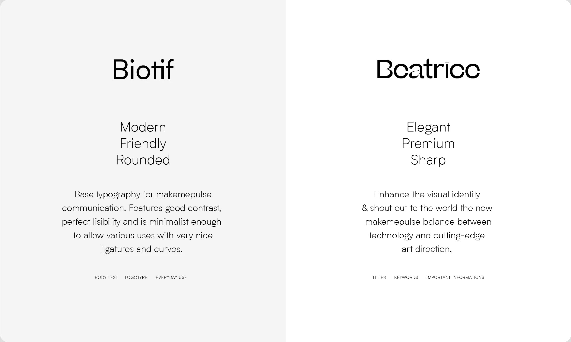
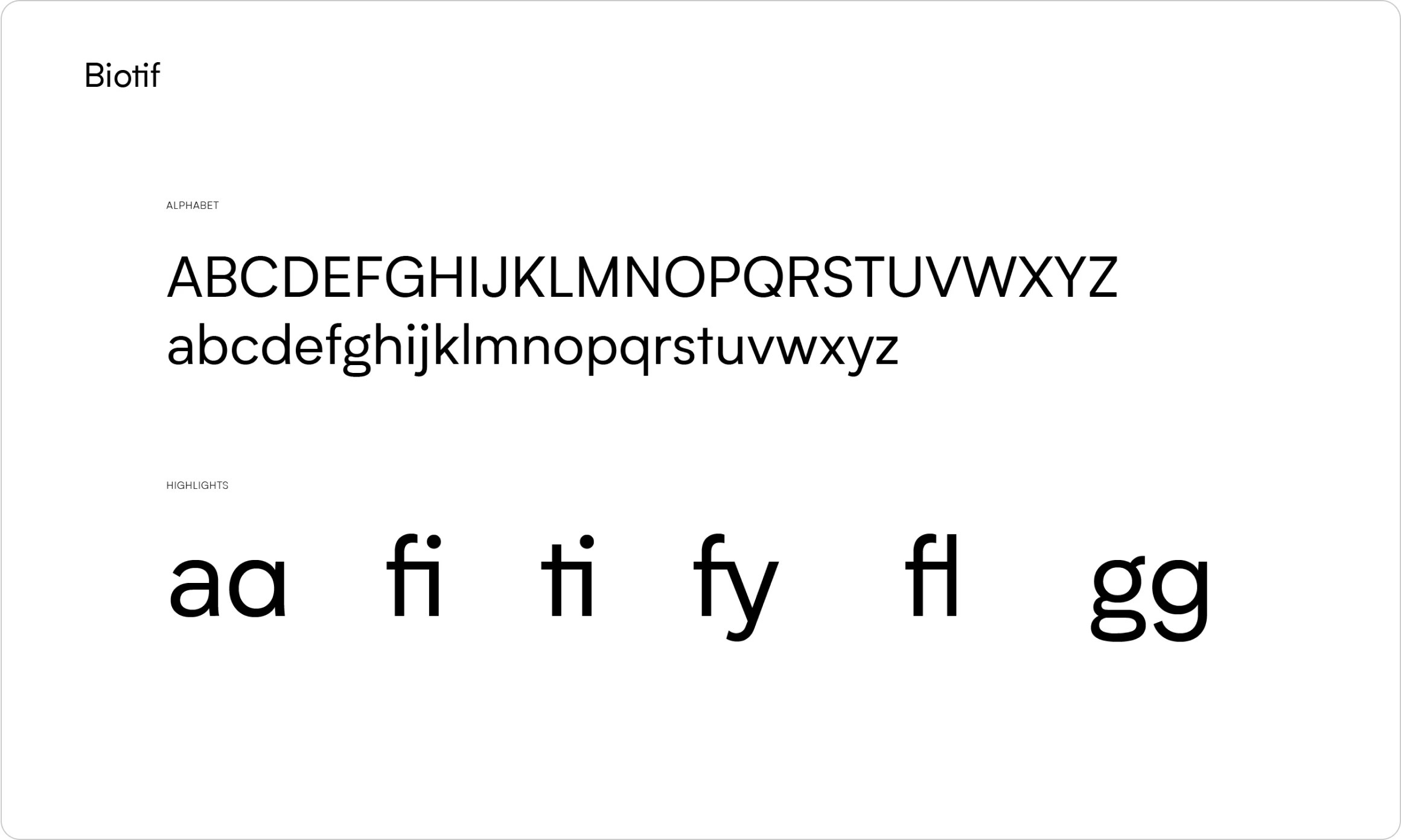
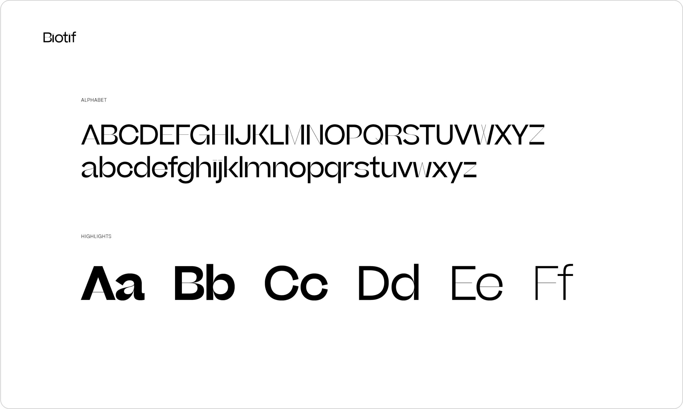
I started with a base typeface for the company name, then adjusted the vertical contrast of certain letters to make it more compact and dynamic. I also created logo guidelines for the team, including examples of how the logo can be customized with specific words and colors.
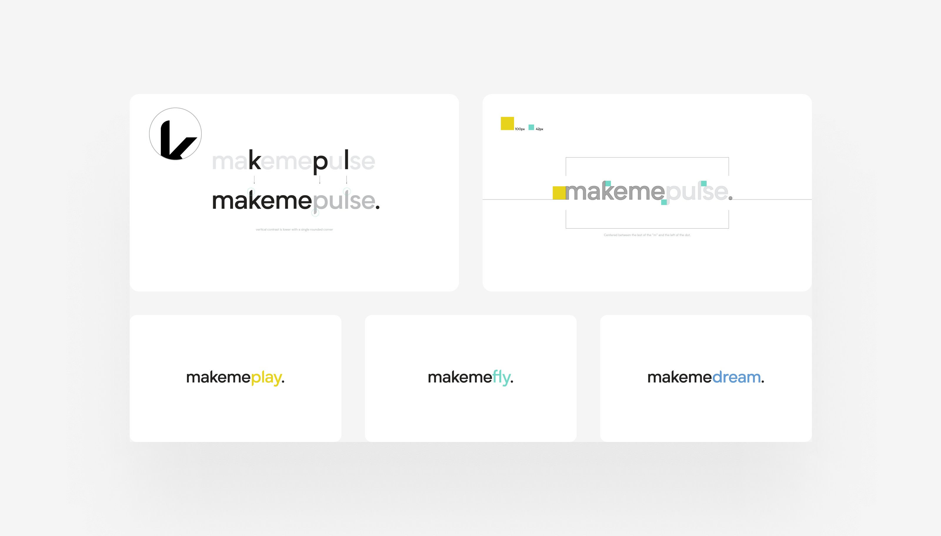
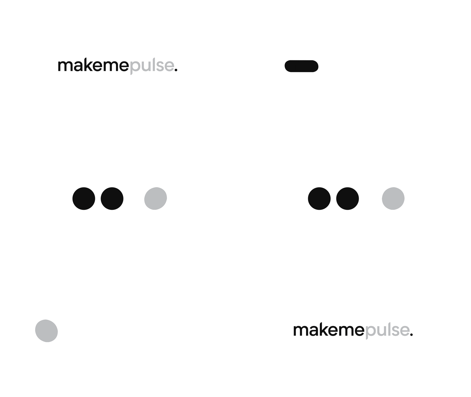
To ensure the logo's versatility across different contexts and sizes, I created two versions: one typographic and one shape-based.
Both versions follow the principle of 'make' and 'me' functioning as a pair, with 'pulse' serving as a customizable element. In the shape version, a dot is customized, similar to how the word 'pulse' changes in the typographic version.
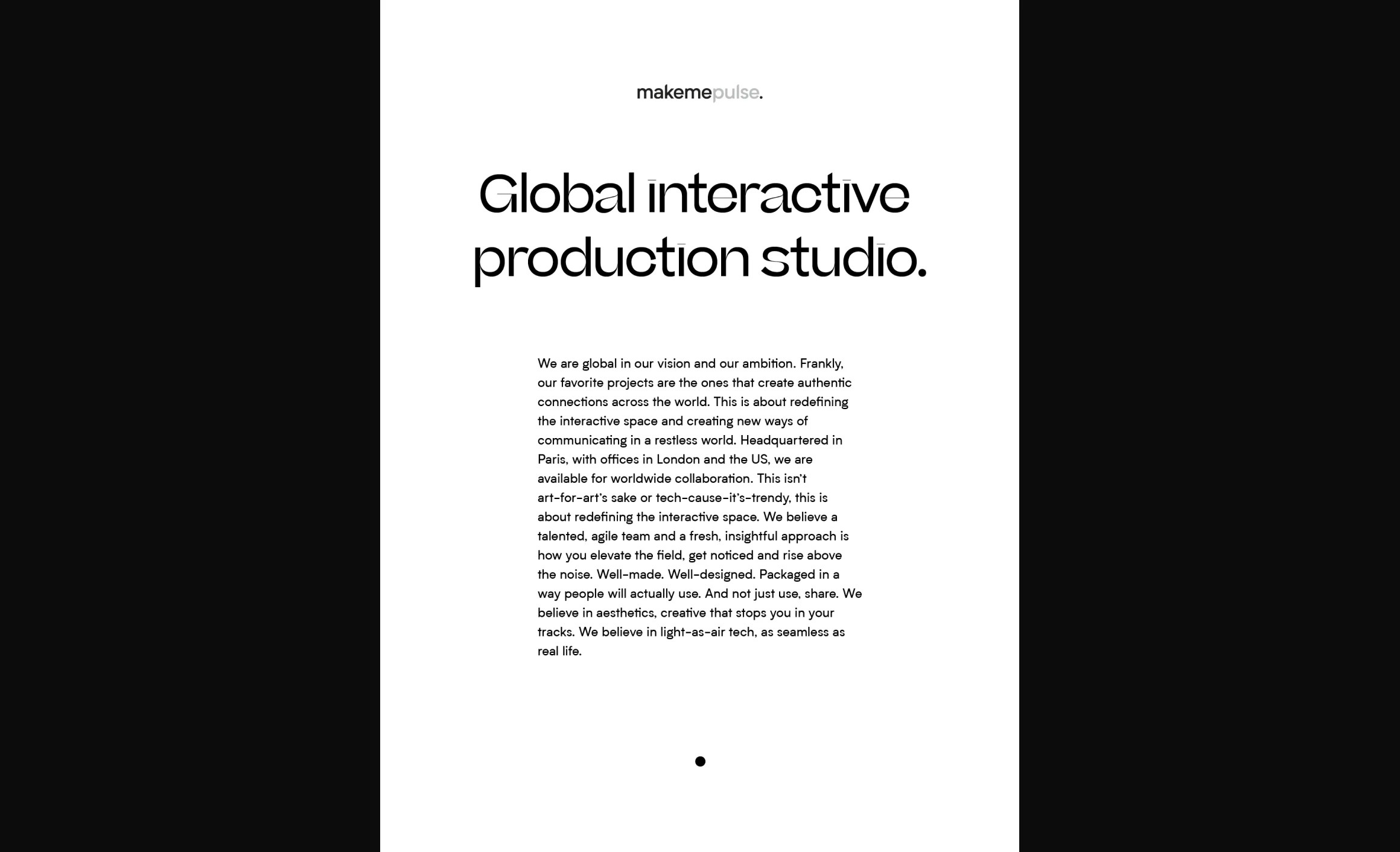
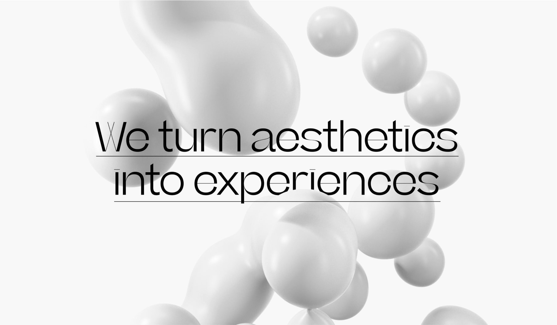
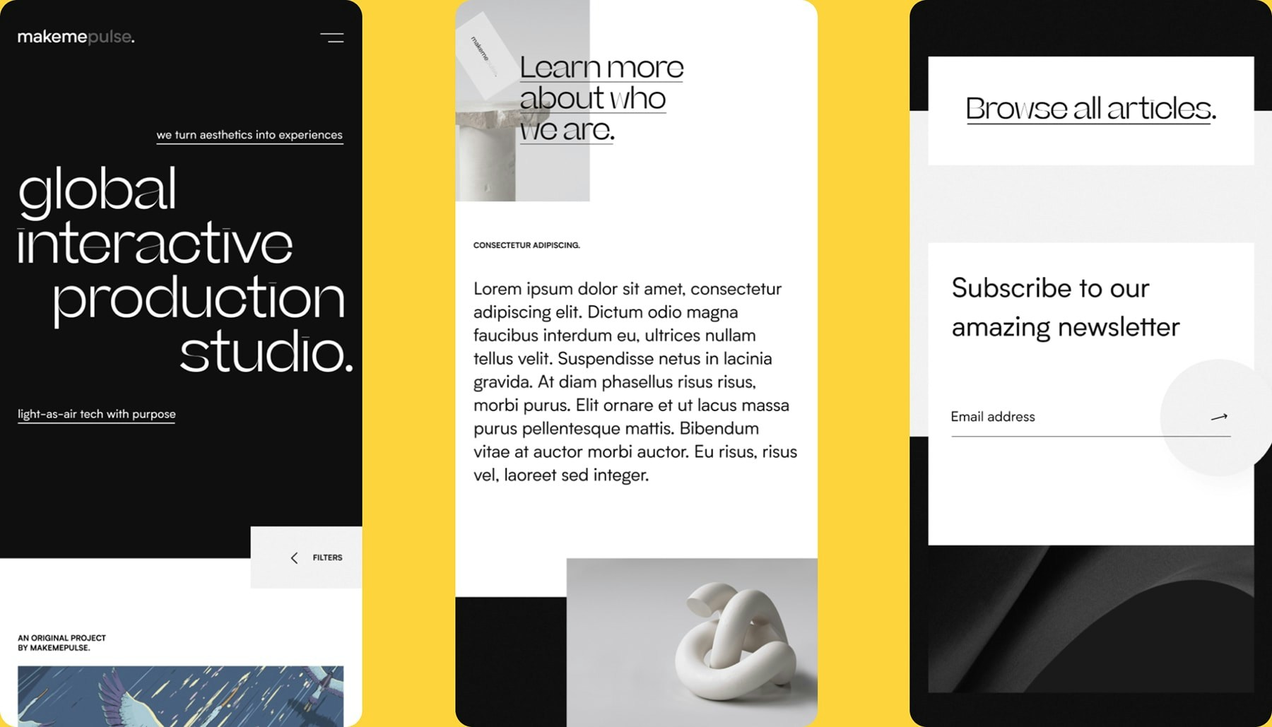
Makemepulse’s DNA revolves around creating immersive experiences and memorable digital stories, so it was essential to bring the same level of creativity to the website. I achieved this by incorporating interface animations and micro-interactions in key modules.

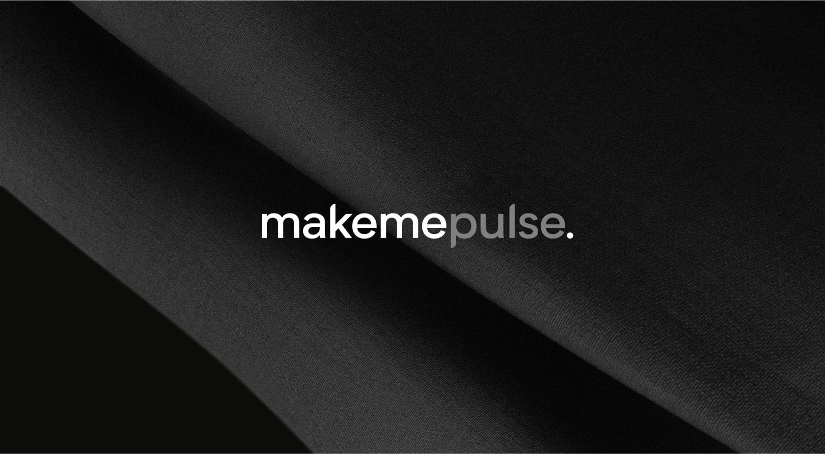
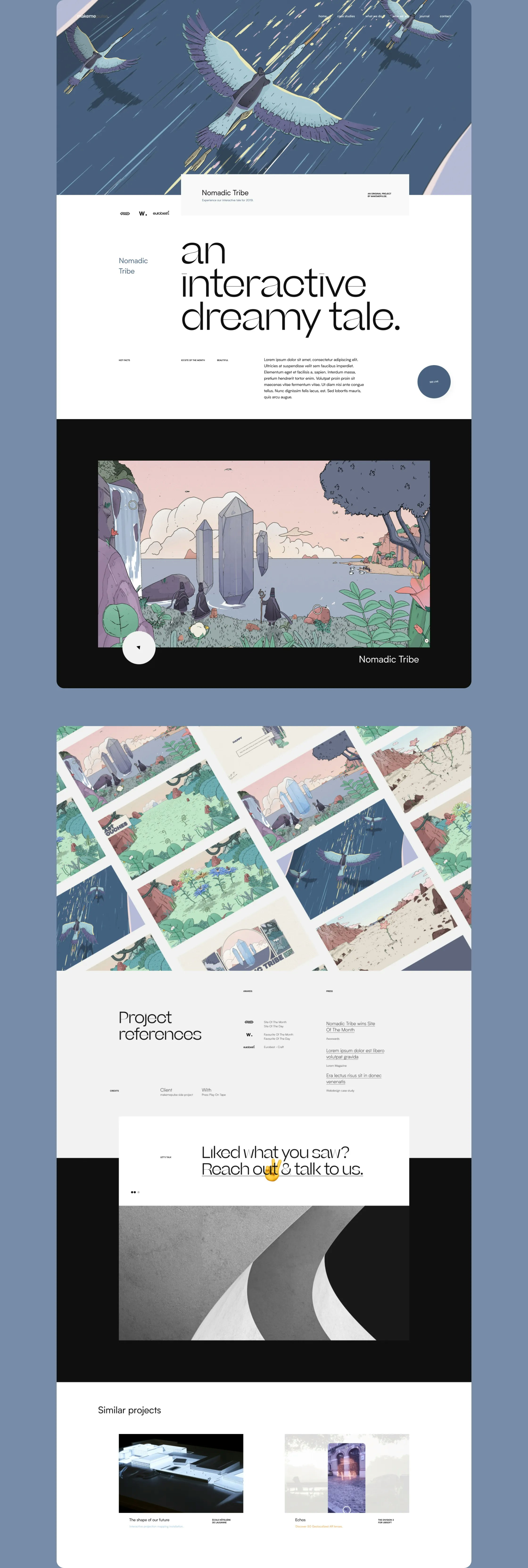
While the full case studies and project pages are focused on concepts and visuals, the studio pages are more playful and interactive.

This module incorporates the three circle shapes from the logo, allowing visitors to interact with them. By dragging the spheres through a ring, they transform into new objects, each with unique materials, sound design, and interactions.
I developed this concept from the three dots in the logo and enhanced it to make it interactive. The transformation of the 3D spheres into different materials and objects symbolizes the studio’s ability to adapt and evolve with each client and project. I collaborated with our 3D artist to create various styles for the spheres.
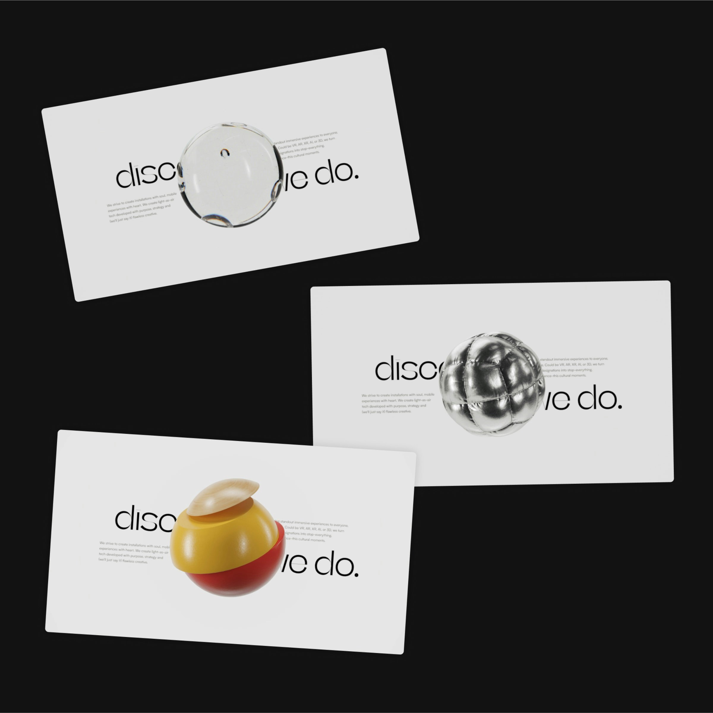
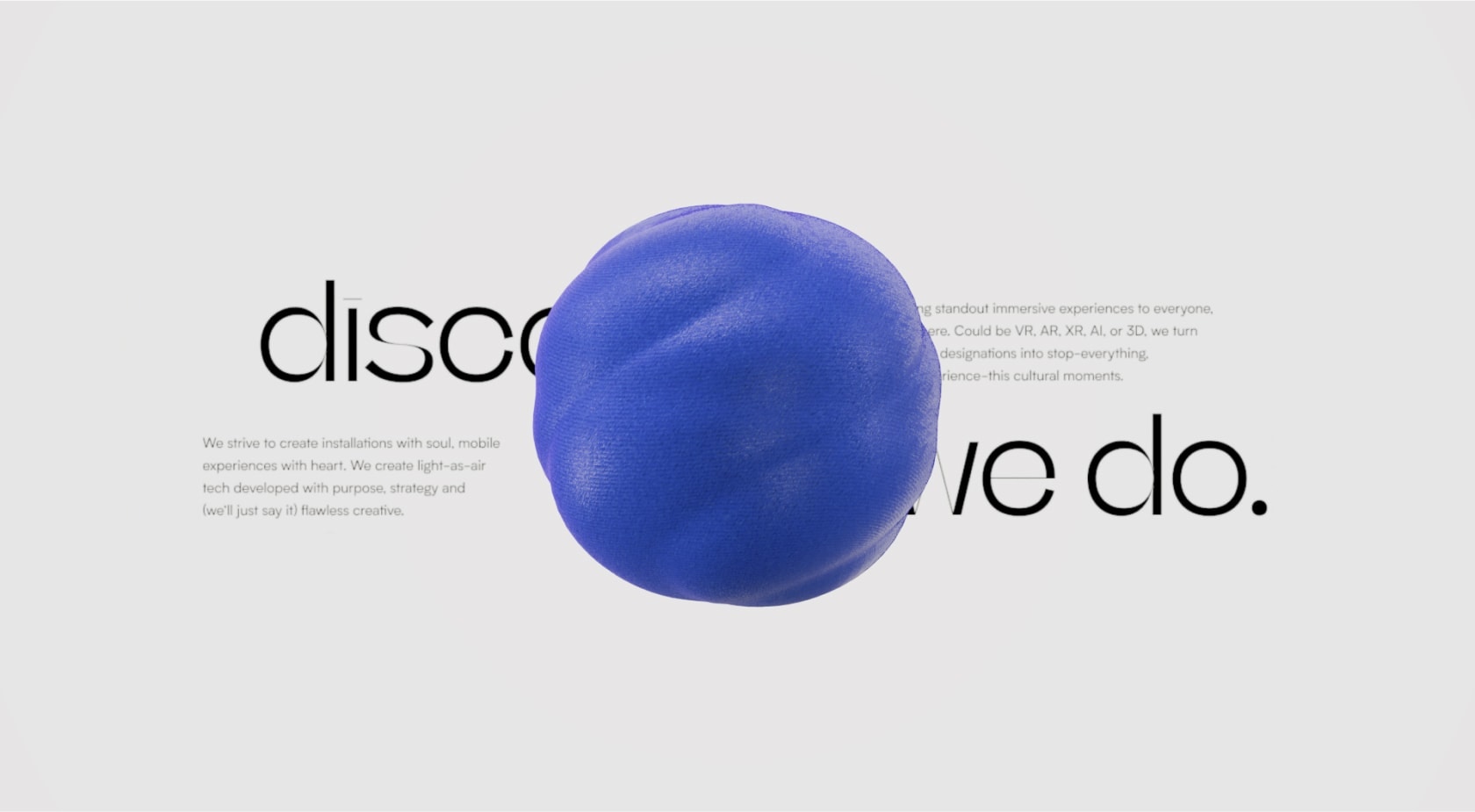
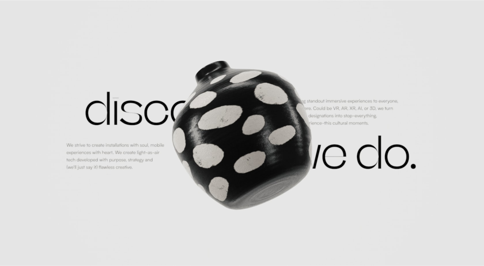
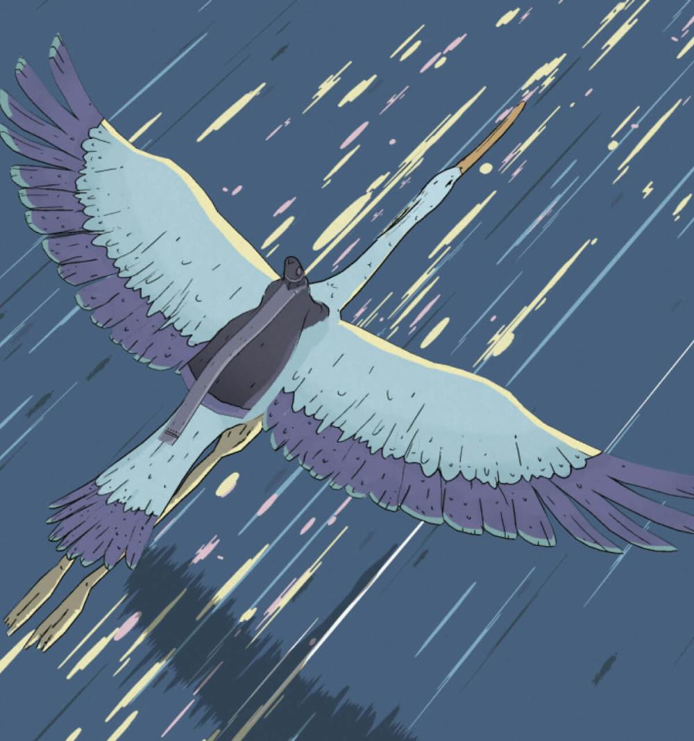
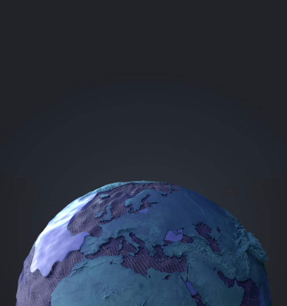
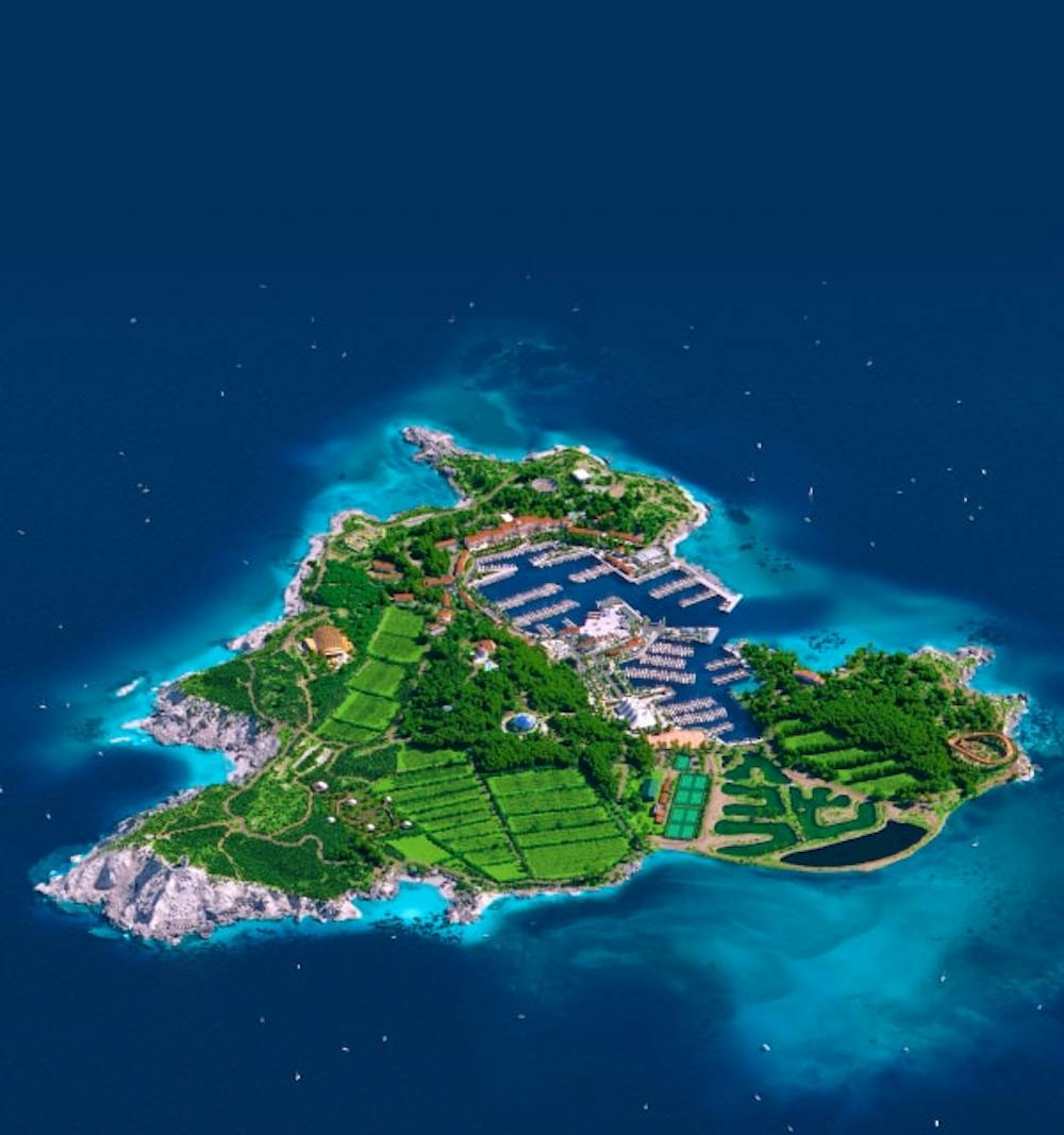
Since 3D is one of the core strengths of the studio, I collaborated with talented 3D artist Anoukia Perrey to create a series of original artworks. The goal was to showcase high-end 3D visuals with a branded, cohesive approach.
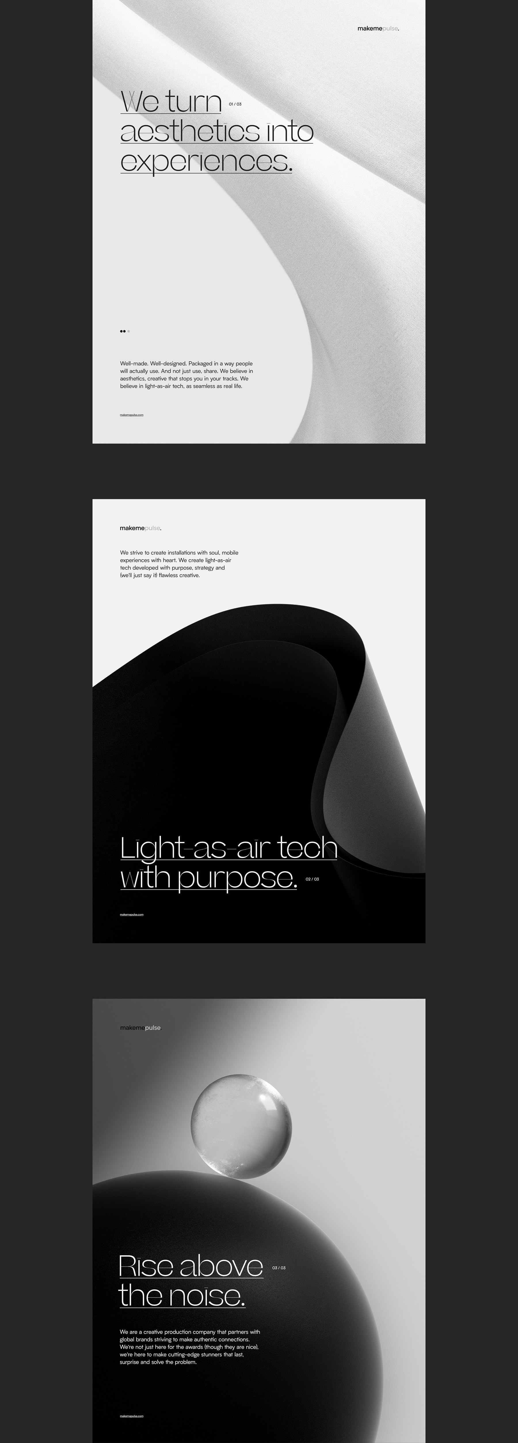
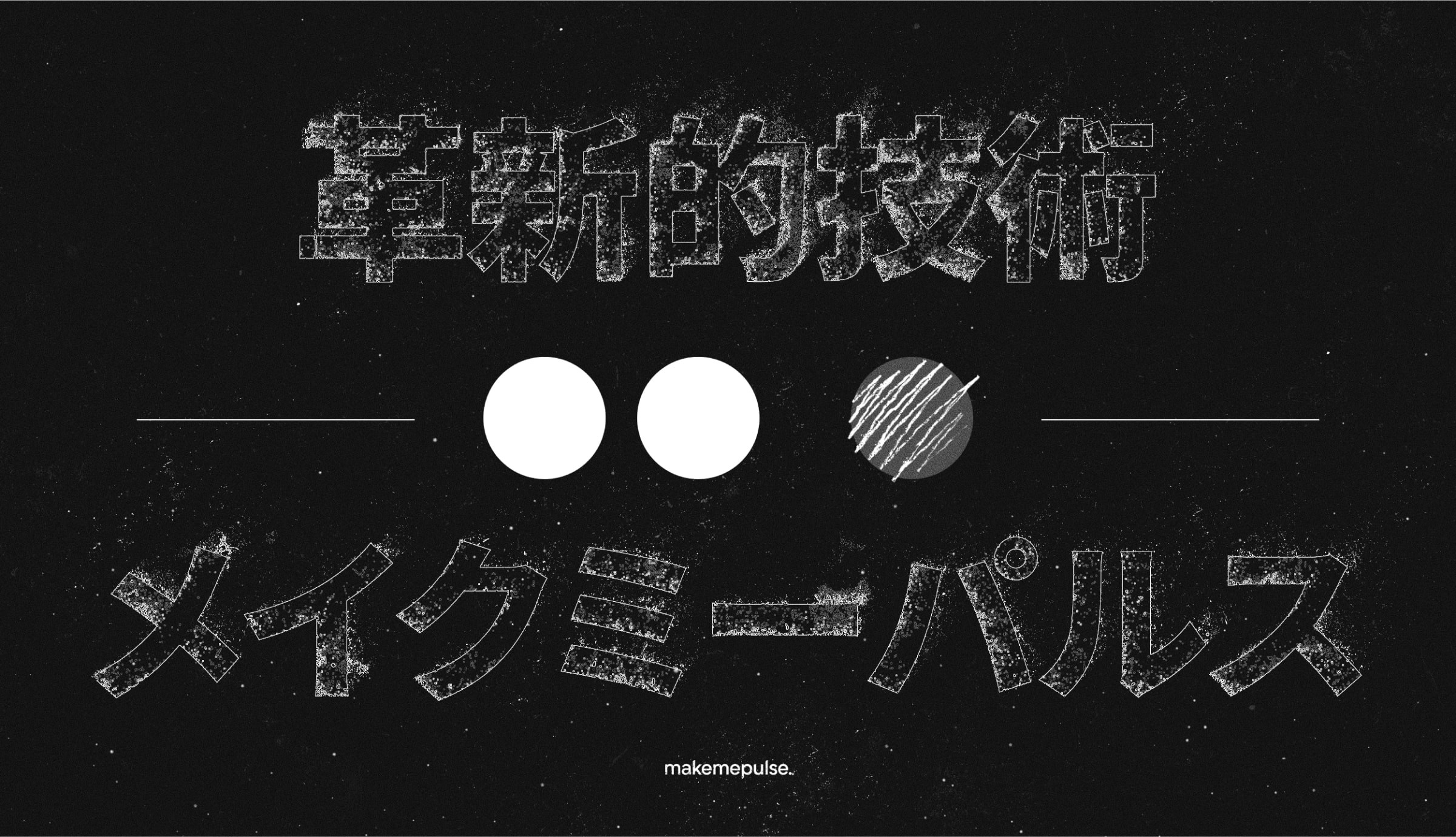
A key concept of the logo was its ability to morph and adapt to various use cases and designs. As mentioned earlier, one of makemepulse's strengths is its capacity to evolve with each partnership, which is reflected in this video. It highlights different projects completed at the studio, along with additional visual explorations.

